Getting started on this project was hard. I had trouble deciding what to do. I started researching Venetian Waltz after the class word list on the board. I got the idea to do Rococo style clothing on animals.
 I started with the background I wanted to simplify the Rococo style just a tad due to the time limit on getting the project done. So I created a texture with circles.
After a few tries I settled on this patterned background. Next was to get my animals dressed. I started with a male, using a lion for the animal. I used this red outfit to create his clothes. I did take some inspiration from the beast in Beauty and the Beast.

 The finished guy turned out really well! I also added my header and the sponsor logos. I used Simplesnails and Sinhala for my two fonts. Simplesnails i found on dafont.com and is the more decorative one. I used the two together so I could have one functional and one decorative text. Next came the next party goer. I picked a female giraffe.
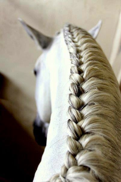
I picked the yellow dress for my giraffe due to the ability to draw it from behind easily. I wanted my characters to be enjoying themselves at a fancy party, though perhaps not dancing. I also was unsure how to do the giraffe's hair until I started looking at hairstyles for horses manes. I decided to go with a french braid.


 Next it was time to add a third character. It was tough to decide what animal to use. I had an idea for a colonel tiger with gray fur around his face. I had difficulty finding military wear from the Rococo period. I decided to do a painted dog I saw at the zoo. A female party goer.
 This is a African Painted Dog. I had taken some pictures at the zoo but their enclosure had a chain-link fence that made the pictures come out subpar. So I googled a good picture of the animal's face so I could get a good image/illustration.
I picked this dress for reference due to the positioning of the dummy. Made the trio have a good story and movement. I didn't do the dress exact due to time constraints and it didn't need to be that elaborate.

I added a chandelier to get the space evenly used and bring the room together. By this time I had figured out my wording and text to advertise the event.
The finished piece is balanced, gives all the information needed for the event, and provides a fun peek into the atmosphere of the event.
.jpg)


