 H is a boring letter. It doesn't have pretty curves like S or and funny tail like Q. It's rigid and plain. I had no idea what to even do with boring H. I threw it aside for a day or so. I finally got to the computer and started playing with the letter forms in Illustrator. Putting them together side to side and on top of each other. I discovered the letter forms combined to make lovely windows or bricks. I used Garamond originally but I found that the serifs were not flush to the baseline. I contemplated Caslon briefly but the ascender of the lower h was too bulky at the top. I settled on Palantino due to it's flush serifs and thin ascender top. It was very business-like, perfect for a series of windows for a high-rise tower.
  So I made a tower out of the uppercase H, rows of 8 letters, stacked one upon the other until I was happy with the height. I made the roof out of the lowercase h. Six letters head to tail to create something that makes one think of the lights used to alert planes of tall architecture and other obstacles they may run into.
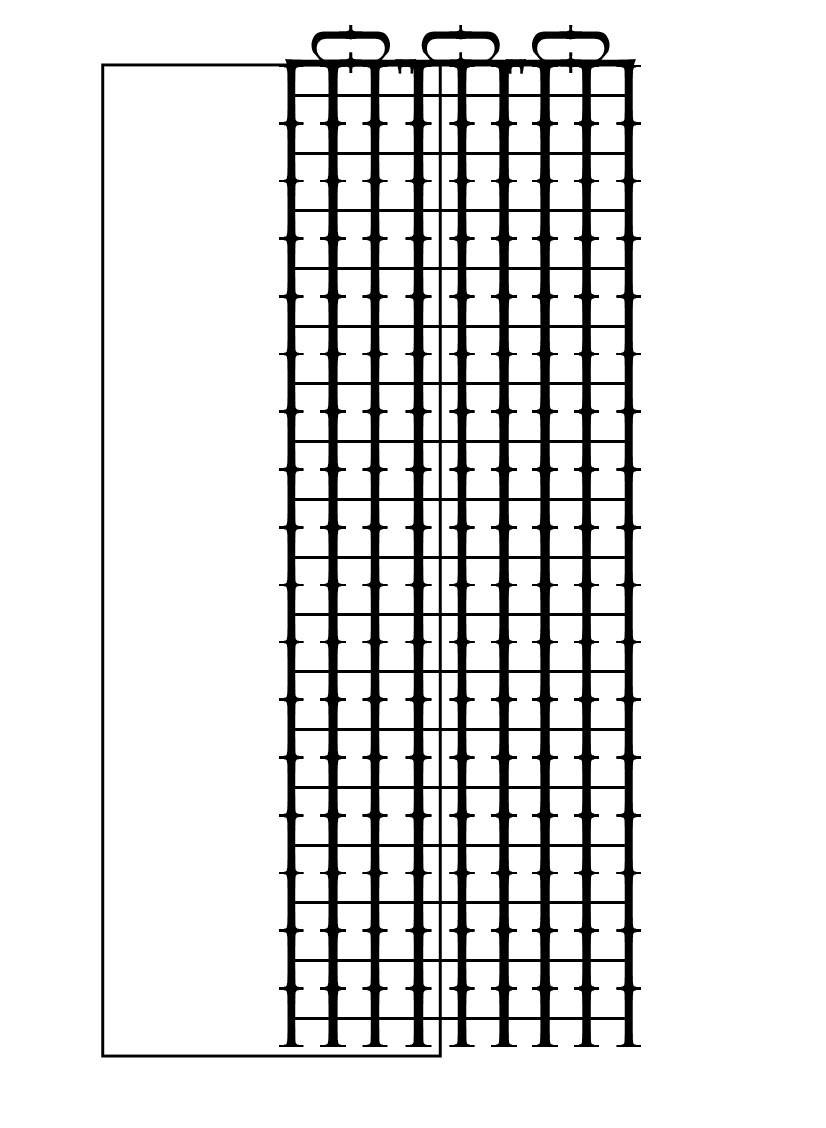
I made one duplicate at a time. I adjusted the shape of the original building several different ways to make several types of buildings. But in all actuality they are made from the form of the original.
 I layered them to make a lovely city scape. Tall buildings, short buildings, wide buildings, and skinny buildings. I made them all a little bit different. I was using my ideas of what a city looks like from watching all the TV shows showing the skyline of New York. It wasn't perfect so I added more.
 I thought I should designate the sky. How? It took me a little while but I decided to make a circle shape. Using the text on the line tool I add Bold Palantino lowercase h's until the circle was full. I adjusted the kerning and the hight of the letters to make the ascenders look like a childbook sunshine with rays.


My completed work using only the letter H.

No comments:
Post a Comment